This week's cover story about Soka University in Aliso Viejo has generated a firestorm of reader comments. The piece discusses the university's first 10 years of existence, as well as the controversial history of the Japan-based, lay Buddhist organization that founded it, Soka Gakkai International (SGI).
Because the story deals with complaints by professors at the university that the spiritual teachings of SGI create a difficult working atmosphere for non-SGI members, we certainly expected a strong negative response from many students, faculty and staff. And we got that in the story's online comments, even though (or, perhaps, because) staff writer Michelle Woo's piece was well-written and well-reported.
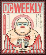
What we hadn't expected was getting accused of being racists for the image we used on the cover–but we've gotten plenty of that, too.
]
I could sit here and try to explain what we were getting at,
metaphorically, with the cartoony illustration of the looming
Buddha-like figure and the smaller people in his hands, but you know
what they say about having to explain a joke. And I don't think anyone
is upset about the cover because they didn't “get” it.
A few of the commenters have gotten nasty–“Proud
Asian” calling Michelle “white-washed” is a particularly egregious
example–but I'm not just going to write this off as the rantings of
anonymous commenters, either. In the past couple of days, I've talked to
several intelligent people of good conscience who didn't see the image
as ethnically insensitive. I've talked to just as many intelligent
people of good conscience–and with no ties to SGI or Soka U–who told me the image was goofy, fucked-up or
both.
I'm writing this note to let you know that if you think the illustration crosses the
line from irreverent-and-ironic (c.f. various and sundry messed-up riffs on the
image of Jesus we've run over the years, to say nothing of the ¡Ask a
Mexican! logo we run every week) into a flat-out racist caricature of an
Asian person, then you should direct all of your ire against the person
who's really responsible for it: me.
As the editor of this paper, I wouldn't have let it go out the door if I'd thought it crossed the
line into offensive. Around here, we like to offend people on purpose,
not by accident–and always in the service of some larger satirical goal.
When commenter “drewrx” wrote, “great article, horrible cover art,”
well, that one stung. The cover should offer a powerful visual statement
that both distills and amplifies the essence of the story–not become a
distraction from it.
If you think the cover showed crap judgment, then the crap judgment in
question was mine, and no one else's.
Please let me know your thoughts directly at tk******@oc******.com or in the comments on this post.
Thanks.
— Ted