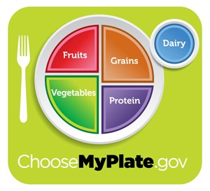
Earlier today, the USDA with help of the First Lady, unveiled the replacement for the old food pyramid.
The new symbol for healthy food consumption is now a dinner plate with fruits, vegetables, grains and proteins subdivided inside a circle in not-exactly-a-pie-chart sections.
Fruits and veggies take up a good half of the plate. Dairy appears in a separate but smaller saucer.
]
This may be non-news to those who've already written off the whole idea
when they revised the original 1992 pyramid into a confusing jumble of
vertical strips that looked more like a rainbow colored rake than
anything meaningful. It doesn't take a civil engineer to know that
pyramids aren't made that way. The efficacy of the message was pretty
much lost at that point.

Along with the new dinner plate concept, there is a website which guides Americans to enjoy food, but eat less of it. The site also suggests a switch to fat-free or low-fat milk instead of whole; and to make at least half your grains whole grains. There's advice to compare sodium in foods like soup, bread and frozen meals and to drink water instead of sugary drinks.
All of this might be well and good, but I think Michael Pollan already beat them to the punch by introducing his credo of “Eat food. Not too much. Mostly plants” in his book In Defense of Food. What more sage advice do we need than that?
Follow Stick a Fork In It on Twitter @ocweeklyfood or on Facebook!
Before becoming an award-winning restaurant critic for OC Weekly in 2007, Edwin Goei went by the alias “elmomonster” on his blog Monster Munching, in which he once wrote a whole review in haiku.

